St. Francis College
Brooklyn, NY
Bringing a Sense of Community to an Urban Campus
For years, St. Francis College operated in different buildings constructed at various points throughout the school’s history. When the campus could no longer support the school’s mission in its existing state, it looked to an unlikely new location – the dense urban setting of Brooklyn.
“As one of the most diverse colleges in America, we educate the entire person and create an environment where people can be both successful and understand each other on a deeper level,” said Kevin O’Rourke, vice president of capital projects and facilities. “We’re very proud to represent Brooklyn with that mission.”
Since the urban setting did not provide an opportunity to identify campus with distinct architecture, statues or landmarks often found on sprawling campuses, the revamped St. Francis College made a statement with a distinct entrance. The ground floor lobby features sweeping curves of MyPlace lounge furniture in the college’s signature vibrant red hue. A bank of elevators leads to the campus housed on the fifth, sixth and seventh floors.
The fifth floor is home to a cafeteria and coffee shop, auditorium, library and admissions office. The sixth floor features a number of lounge and huddle spaces in the hallways outside classrooms, student activity rooms and a radio station. The seventh floor boasts state-of-the-art laboratories, student advising services and faculty suites.
“We were very intentional with how we designed these groupings,” noted O’Rourke. “Some of the neighborhoods feature furniture with soft seating, while others are more businesslike. We knew KI was a leader in the education space. They gave us a space plan for the entire facility. It was a huge success.”
Teaming with KI, college leadership ensured the three-story vertical campus upheld its mission by encouraging student and faculty interaction. Creative planning also made sure SFC met the needs of its commuter student population and incorporated natural design elements to provide a sense of respite among concrete surroundings.
Bringing Students and Professors Together
During the planning process, the team voiced that interaction and mentorship among students and faculty were core to the college’s mission. The campus was designed to uphold that direction, starting with a grand staircase strategically positioned by the cafeteria and coffee shop.
“The building was designed for the grand staircase,” said O’Rourke. “It’s the first thing you see when you arrive. Students study, lounge and socialize. It’s where the action is.”
The intentional design of social spaces inside and outside the classroom fosters a sense of community and connection.
Laboratories offer Ruckus worktables equipped with Intellect Wave task stools for hands-on STEM learning. The glass-front student government office provides a line of sight into a business-style environment featuring Oath task chairs, Connection Zone benching and storage pedestals where students can start to understand what it may feel like to work in a professional environment.
One of the most notable differences on campus is the faculty suites. Instead of private offices, there are spaces that can be reserved and booths where students can work alongside professors. The access to professors provides students with real-world experiences that build confidence.
“I really look forward to getting out of my office, plugging in my laptop somewhere in one of these hallways and seeing who comes by,” said Dr. Jennifer Lancaster, vice president of academic affairs and academic dean. “You can work anywhere on this campus. That’s one of the beauties of the design. That creates a culture where students, employees and faculty want to be here and interact with each other.”
Places for Commuters to Park
With a large commuter population, SFC wanted an environment where students felt encouraged to stay. The college ensured there were a variety of places for students to study, collaborate, socialize and recharge for the duration they are on campus.
SFC programmed hallways and nooks with comfortable furniture such as MyPlace seating and ottomans and Lyra sofas and chairs where students can kick up their feet and relax or socialize.
The furniture is also functional. Doni café stools paired with Serenade gathering tables provide a contemporary study space, while curved Pillar tables along the back of curved MyPlace seating offer a place to charge devices.
Connection Zone storage lockers serve as a visual separator of space between seating configurations while giving commuter students a secure place to store belongings while on campus.
The library incorporates Tattoo screens and Connection Zone screens on casters so they can be moved around to create visual privacy. The screens double as markerboards or tackboards for added functionality.
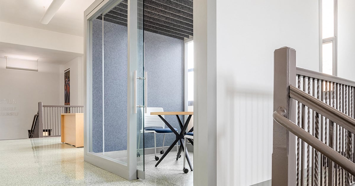
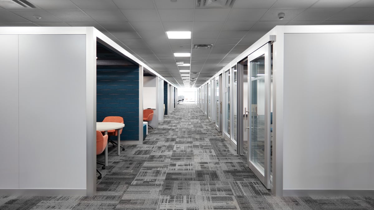
In addition to the seemingly endless array of spaces to hang out, the team used WiggleRoom Super Structures to create private huddle rooms within the open areas on the sixth floor. The freestanding units provide interior architecture without permanent connections, eliminating the need to rework fire safety or HVAC systems.
One size accommodates two to three students, while a second larger size can fit up to five students.
“The Super Structures give students a private place to gather and get a little louder,” said O’Rourke. “They can write on the markerboard walls and discuss things interactively.”
The WiggleRoom Super Structures have glass doors with neoprene sound seal gaskets and gray PET felt louvered ceilings that help absorb excess noise. The acoustic performance ensures students working in the lounge spaces on C-Table personal worksurfaces outside the units are not disturbed.
The interiors of the Super Structures have integrated power and are stylishly outfitted with Katera guest chairs or upholstered Doni guest chairs around Athens or Pillar tables.
“The huddle rooms are definitely the number-one spot for a study session,” added student Nargiza Sohirova.
The various spaces support the needs of commuters as well as the modern student body.
“A hybrid model doesn’t mean that you’re on campus less,” Lancaster said. “You can be on campus more. It’s just that the time you spend on campus isn’t necessarily in the traditional classroom setting.”
A Natural Setting Amid the Concrete
To incorporate a sense of nature into the urban campus, the design leveraged opportunities for natural light and other elements through biophilia, wood accents, organic shapes and a nature-inspired color palette that complemented school colors.
Sunshine pours through the floor-to-ceiling windows along the exterior walls, flooding the interior with natural light and providing breathtaking views of downtown Brooklyn. The school’s 30 classrooms feature crisp white modified Instruct All-Terrain lecterns and Intellect Wave chairs with chrome legs, helping to reflect that light. Ruckus activity tables emulate the sky with pops of ultra blue.
“The openness and light had a transformational effect on our students,” said Lancaster. “Our faculty members are reporting that students are more engaged in the classroom.”
The aforementioned grand staircase is constructed of wood and dotted with custom cushions in Nomad and Aphrodite upholstery from Pallas Textiles, creating stadium-style seating and serving as a hub between the fifth and sixth floors.
The cafeteria and Brew Stop coffee shop feature wood-toned Serenade gathering tables and low-back Apply café stools for groups to gather, while high-back MyPlace booths and Athens tables with a wood edge cater to those grabbing a bite to eat.
The library features wood Crossroads bookshelves, while the 300-seat auditorium features custom wood-framed Lancaster auditorium seating with an upholstered back for a warm, welcoming aesthetic.
“We incorporated a lot of wood around the college to make it a warmer, softer space where our students can feel at home,” said O’Rourke.
The bright white and wood tones are balanced by elements featuring the school’s vivid red and blue colors in creative ways throughout the campus, including wall art, the painted legs of café stools and seating upholstery such as on MyPlace lounge seating and Calida lounge chairs and stools.
Realizing Franciscan Values of Community
The SFC campus was thoughtfully designed to be a welcoming, comfortable and collaborative environment for both students and faculty. The result is a campus that embodies Franciscan values and cultivates a tight-knit sense of community. The student reaction couldn’t be any better. Students are hyper-engaged with the spaces on campus, often seen gathering with friends outside of class.
That sense of community makes for a better educational environment and molds St. Francis College students into good citizens with a deep appreciation of their peers and the community they inhabit – something they will carry with them long after graduation.
“KI’s resources and the team they brought to this project were incredible,” said O’Rourke. “This project wouldn’t have happened if it wasn’t for KI.”